Clinect
About The Organisation
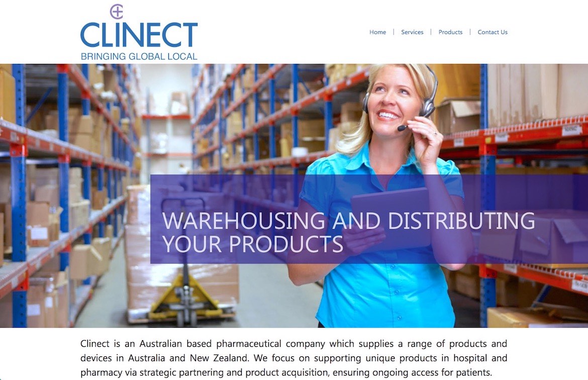
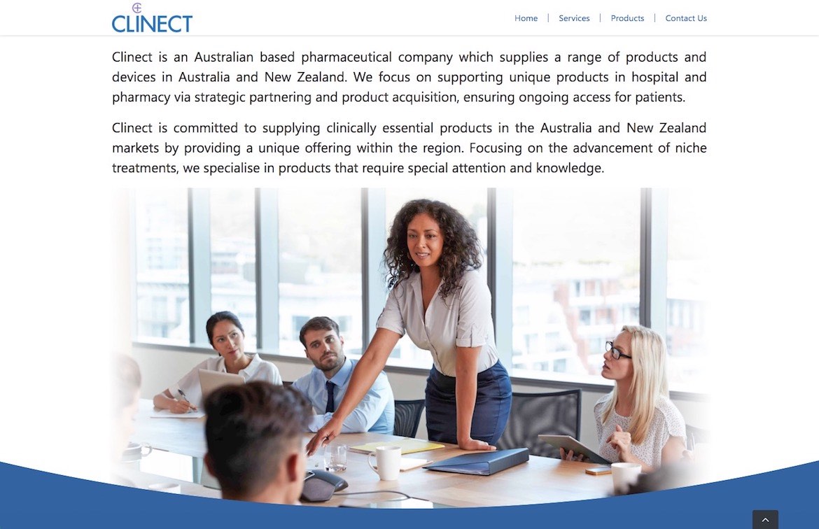
Clinect is an Australian based pharmaceutical company owned by EBOS Group which supplies a range of medical products and devices in Australia and New Zealand. Clinect focuses on supporting unique products in hospitals and pharmacies through strategic partnering and product acquisition, ensuring ongoing access for patients.

Rebranding
Clinect wanted to establish a modern corporate identity, bringing forward the following company identifiers:
- Having the ability to providing local expertise, with deep industry understanding;
- Being approachable, responsive and solution orientated;
- Having the ability to navigate and simplify complex processors in a nimble manner, while providing the assurance of a trustworthy and large organisation.
They wanted to achieve a responsive, thoughtful and trustworthy female-led brand personality. Aiming to present a scholarly and self assuring modern and elegant atmosphere without overstating, being over-authoritative or aggressive.
Logo Application Consideration
The brand will be represented on a wide host of platforms ranging from small/mono/negative applications on packaging, websites, trade-shows, printed collateral, printed media, data sheets, and sell tools.
Considering these applications, target markets, and styling/brand discussions held between Clinect and our team, it became clear that the visual language guiding the brand must be very professional, clean, easy to read even in small applications, intuitive and memorable.
Logo Design
The chosen logo design combines a trademark design (which can also be used independently) and a logo design.
The typography chosen for the word “Clinect” presents a very professional modern styling that is very easy to read, yet unique within the market. The balanced slim letters clearly support the brand’s elegance and scholarly atmosphere while increasing readability.

The cross in the centre of the trademark, is perhaps the most intuitive symbol for this application, as it has been associated with professional healthcare and medicine for generations.
The letter “C”, enveloping the cross, in a matching font and visual language to the logo’s typography, aims to assist in making the connection between Clinect and the unique abilities and trust it seeks to represent. Showcasing in the one symbol that Clinect encapsulates all relevant qualities required to help customers get to where they want to be.
Due to its unique design, the logo selected is easily transferable to ‘mono’, ‘grey scale’ and ‘negative’ design applications.
Colour Selection
It was noted that the colours previously used to represent the brand present a few issues with the now refined company direction:
Firstly, they tend to clash with partner and client brands – presenting an issue with packaging applications.
Secondly, they tend to represent ideas that are less aligned with the brand image Clinect is striving for. For example, within the context of healthcare and medicine, lime-green tends to represent youth, ‘non-pharmaceutical’, and ‘alternative health’.
Old brand colours

For these reasons, the complementary colours we have selected for the brand revolve around the blue and purple scales.
As far as subconscious associations are concerned:
Blue tends to be associated with loyalty, heritage/history, calmness, and confidence.
Purple tends to be associated with a deeper level of thinking, compassion, listening, and intelligence.
We have chosen to use the icon component of the brand in a slightly more translucent tone of purple. This was done to give an additional touch of ‘transparency’ to the identity, putting an added focus on the approachable nature Clinect wishes to project.
New brand colours

Tagline
-
The tagline created to support the brand’s activity and personality is:
“BRINGING GLOBAL LOCAL”
The word ‘bringing’ sheds light on the brand’s main activity: importing (bringing) products, ideas, opportunities and solutions.
The transition from ‘global’ to ‘local’ sheds light over the speciality of Clinect in working with global enterprises, while being focused, influential and knowledgeable within the local markets.
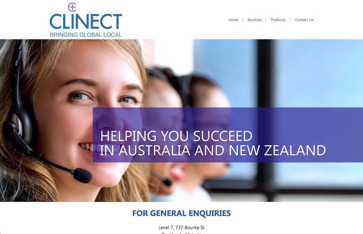
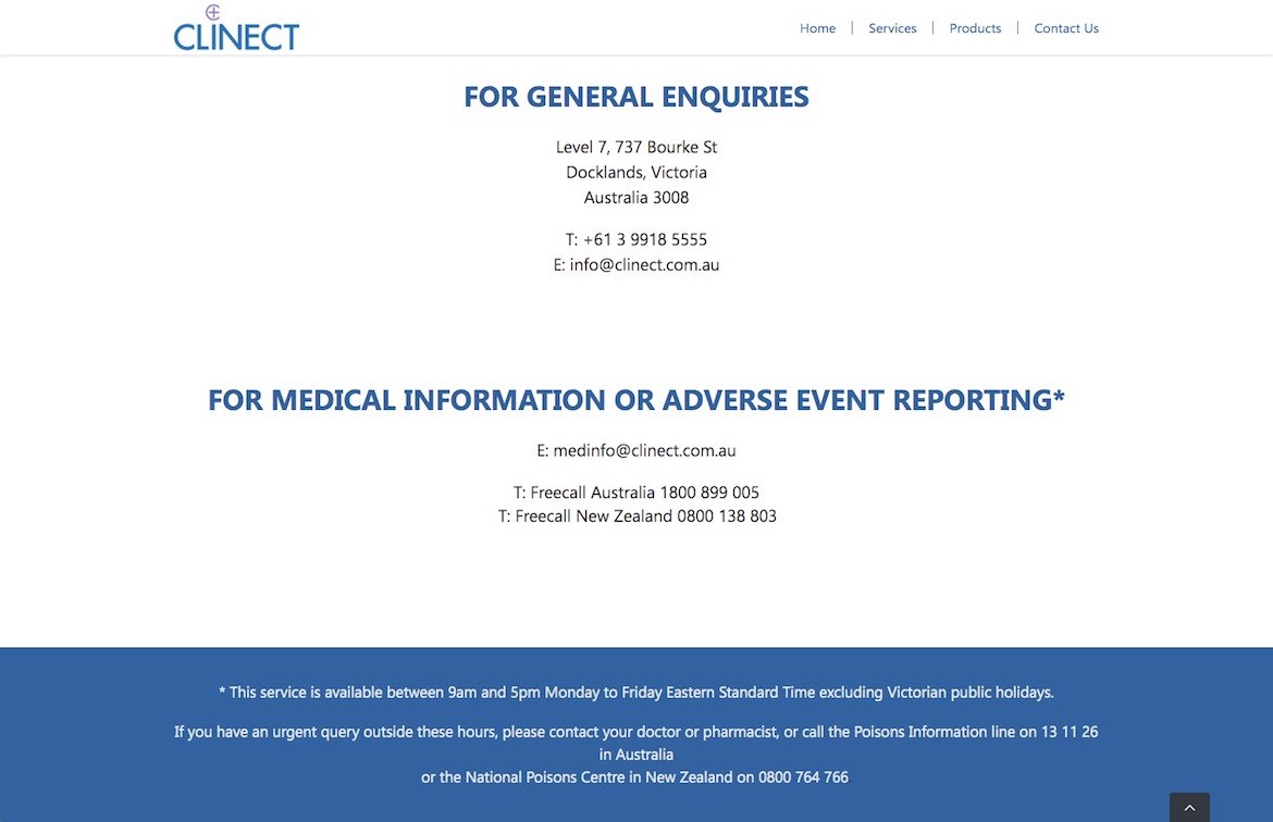
Website Design
The website developed was designed to reflect the new identity and give further focus onto the brand’s crystallised direction. There was a big focus on making the website interactive, intuitive and easy to navigate, all without compromising the brand’s identity and key emotive messaging.


Presentation
One of the key communication tools in the medical corporate world presentations. We have made it a point to create a presentation that immediately resonates with the brand developed.

Style Guide
A brand is only as strong as its integrity and consistent reproduction over time. With a large number of employees, partners, colleagues and suppliers, it can be very challenging to ensure that the brand doesn’t get compromised. For this reason, a detailed brand book was developed to help all relevant parties protect and support the brand into the future.

Brand Communication Collateral
Further communication collateral was created in line with the brand’s new look and feel to support the Clinect identity and gravitas across their regular communication tools.


Promo Tools
To help bring further attention to the new identity’s launch, a mouse pad and coaster combination were designed in line with the brand’s visual language as a promotional giveaway.