IntelLink
A Bit About The Organisation
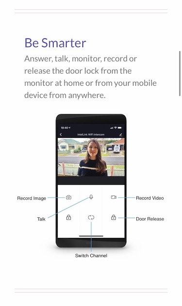
IntelLink is a home security brand by PSA Products. They develop, supply and distribute their very own WiFi security and monitoring devices. Their products can be easily linked up and communicate with each other as well as with mobile devices using the internet.
Logo Design
The logo was designed to visually emphasise the portmanteau nature of this name, assisting each word to be ‘heard’ in the audience’s mind, and at the same time ensuring it is clearly understood as a single entity.
The typographic work revolves around creating a very clean, minimalistic and balanced approach, with a big emphasis on legibility, even when dimensions are shrunk down. The curved nature of the letters also assists in creating a very smooth and clean feel overall.
The brand symbol, flowing from the lower-case letter “i”, has been designed to resemble a far reaching wave, emphasising the connectivity and communicative features of the product rage.
The colours used were selected to be a ‘Technological’, ‘New’ and ‘Gadgety’ light blue, in combination with an “Intelligent” and “Trust Worthy” looking dark blue.
App Icon
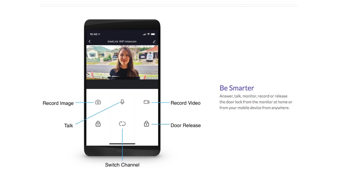
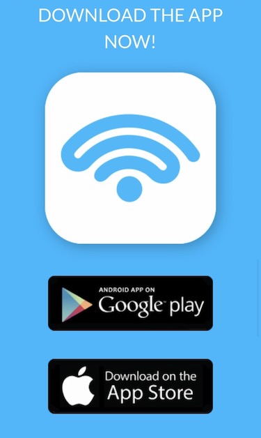
Knowing all IntelLink products are to be connected to mobile devices via an app, we have designed the logo in such a way that the brand symbol could naturally and easily fit into a beautiful and unique looking mobile app icon.
Brand Name
Through brand development workshops with the client, and with careful consideration of the developing product range, target markets and the competition, the name selected was IntelLink. IntelLink is a portmanteau, combining the words intelligent and link.
The word smart has incredibly deep roots when it comes to associating advanced home-security technology and cross-device communicability. At the same time, the word smart is entirely and completely overused in brand names in this market-space, making it less of an ideal choice as a brand name when considering the competition.
Being a synonym of intelligent, the word evokes similar ideas, while also suggesting a higher level of design, intention, and capability. Additionally, the word intelligent implies a much higher degree of knowledge and excellence in comparison to the word smart – one that takes a much greater effort, attention and investment to achieve.
The word link simply relates to the key feature of the products in the range – that is, their astonishing ability to easily and efficiently communicate and connect with each other and with mobile devices.
Additionally, since the IntelLink products are also about connecting between people and their homes, the word link also stands for the sensory connection enabled with their technology, which allows the user to hear, see, speak, sense and respond to remote interactions in and around their home.
Tag Line
“Smarter Safer Better” was selected as a tagline for its simplicity. The whole philosophy of IntelLink is presented within these 3 seemingly simple words.

“Smarter” – As mentioned earlier in this piece, the word “smart” has a very strong hold both in relation to the products created by IntelLink as well as the industry as a whole. Choosing the “er” ending in “smarter”, once again supports the idea that IntelLink is not “just another player” in the home security market – they are at the cutting edge of it and are one step ahead of the competition.
“Safer” – Making it crystal clear that safety is the major guiding factor behind the organisation and its designs. Again, the “er” ending is pushing that notion even further. Calling attention to their products are even safer than the alternative.
“Better” – This word’s main focus is to be an associative vehicle for the brand’s key messages.
For example: “sleep better at night when your home is connected and protected”.
Or: “better durability”, “better design”, “better connectivity”, “better user experience” and so on.
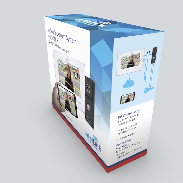
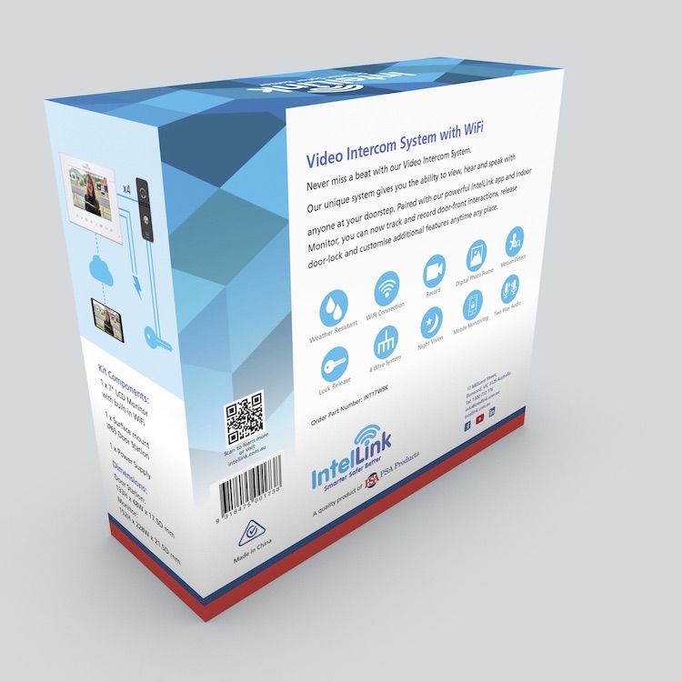
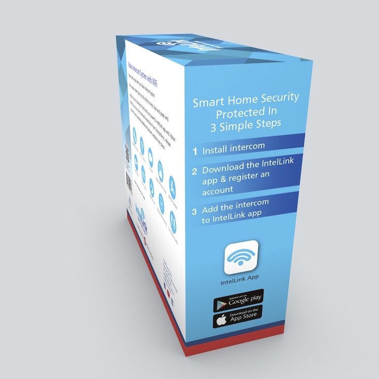
Packaging Design
Creating a visual language that would flow and develop on the brand design was the greatest achievement of this step. The packaging was designed to be clean and to the point, easy to read with helpful icons and other graphic tools to make it accessible and intuitive for anyone to use.
The photographic work on the front face was created to add a local Australian and realistic view into the composition, while showcasing the core essence of the product in one carefully crafted snap.


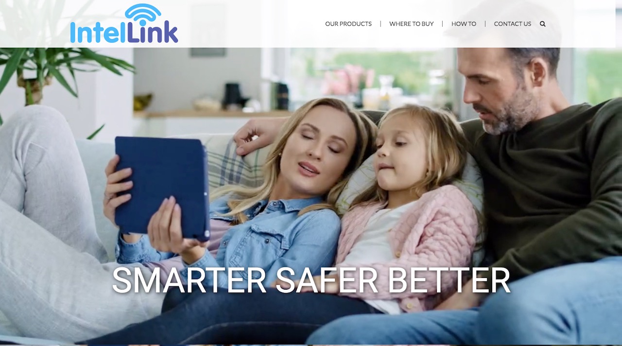
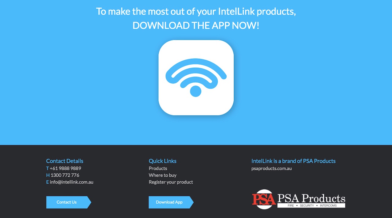
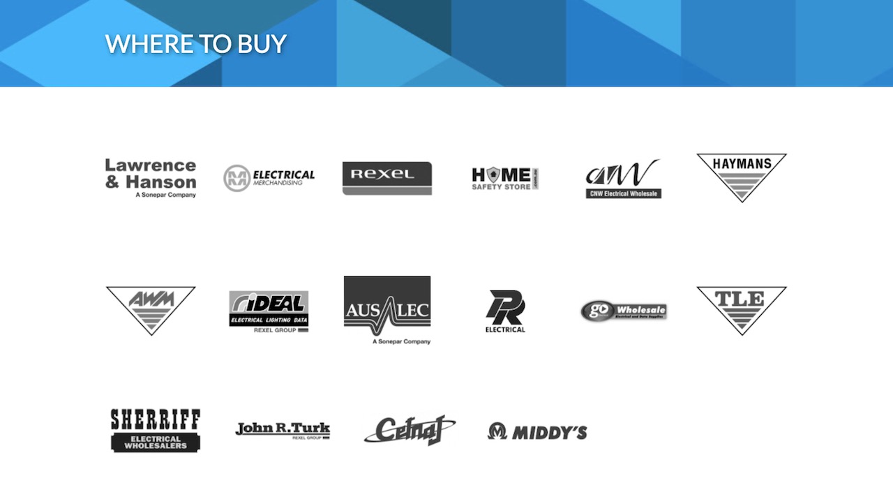
Website Design
The website was designed to match the cutting-edge identity represented by the brand. This was achieved by utilising the latest strategies in web design, advanced programming techniques, and an expandable-interest UI and UX psychology.
The website is simple to use, intuitive, easily adaptable, and projects the brand spirit on every single page – providing a central platform for all things IntelLink.