TIC – Total Instrument Controls
A Bit About The Organisation
Established in 1986, Total Instrument Controls is a Tasmanian owned and operated business. It is the state’s leader in delivering industrial instrumentation, automation and control equipment to the mining, food, beverage, petrochemical, pharmaceutical, water and waste water industries.
TIC specialises in the provision and optimisation of systems and processes with solutions that are tailored to meet the industry requirements of their manufacturing and processing clients. TIC also provides an extensive after-sales support state wide.
Logo Design


Colours
ORANGE – The TIC shade of orange psychologically corresponds to the firm’s high levels of product innovation, technology, pioneering and responsiveness.
BLUE – The TIC shade of blue psychologically corresponds to the firm’s heritage, gravitas, technical support, and deep understanding of the pro industries which they serve.
The logo has been developed in Positive-Full-Colour, Positive-Mono-Colour, Negative-Full-Colour and Negative-Mono-Colour. By providing Total Instrument Controls with all these logo formats, they can now confidently approach any style of print, embossing or digital reproductions of their logo while enjoying brand unity and a consistent look and feel.
Acronym
Over the years, Total Instrument Controls’ clients and staff have introduced the TIC acronym to the firm as a short-hand nickname. Psychologically speaking, nicknames are a sign of favouring and fondness, and in TIC’s case, there was over 35 years’ worth of fondness to be considered. So it was important not only to retain this shorthand, but to proudly coin it as a key focus in this logo.
Typography
The letters in the acronym have been designed in bold letters, to evoke the long-established nature of the business, its trustworthiness and its gravitas. The letters have also been gently slated forward to suggest the firm’s fast responsiveness as well as their ever-growing efforts to be at the cutting edge of technology, capabilities and process. The font created also features many sharp angles and accurate curves, to further enhance the sense of cutting-edge and forward motion.
The Tick
The trade mark tick has been designed to be perfectly contained inside the letter “C” on one side, but break past and above the top line of typography on the right-hand side. This feature has been carefully developed to showcase the client’s out-of-the-box thinking and methodology when it comes to customising solutions for their customers.
Presentation Folder, Insert & Booklet Design & Print Production
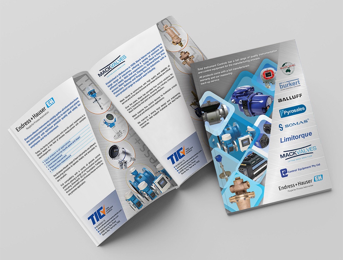
Concept, design and development of a tailored B2B and B2G Presentation Folder, Booklet + LeaveBehind Brochures.
Total Instrument Controls works predominantly with large professional corporations, offering a wide range of products and highly technical solutions. They often need to present or introduce clients to specific brands, products and capabilities in order to educate them and help them select the best solution for them.


Business Card Design & Print Production
Designed in line with the new logo and visual language. Incorporating typography-based angles, suggestive industry images to instantly evoke TIC’s forté, as well as double sided textured lamination and a selective-sheen layer over the logo, to further enhance the card’s overall presence, feel, uniqueness and appeal.

Label Design & Print Production
Designed in line with the new logo and visual language.


